Polices esthétiques pour Instagram: Améliorez vos légendes !

Instagram | 23 mai 2024
Même si Instagram se concentrent principalement sur l’aspect visuel, les mots contribuent néanmoins de manière significative à la création de contenus captivants sur la plateforme. Des légendes aux superpositions de texte, les mots apportent du contexte et une touche créative aux publications quotidiennes. Mais sur Instagram, rien ne doit être ennuyeux, pas même les mots. C’est pourquoi les polices esthétiques pour Instagram sont de plus en plus prisées par les créateurs de contenu.
Les polices élégantes, qu’elles soient classiques ou ludiques, sont idéales pour attirer l’attention des internautes lorsqu’ils font défiler votre page. Mais comment tirer pleinement parti de ces polices ? Et comment apporter une touche d’originalité Instagram qui ne proposent pas d’options de police, comme les légendes de publication ? Continuez à faire défiler pour découvrir tout cela et bien plus encore dans ce guide complet des polices Instagram .
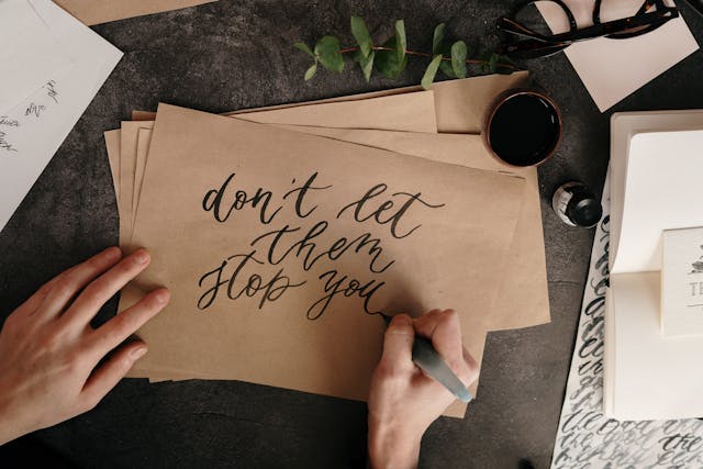
L'utilisation de polices de caractères esthétiques pour Instagram présente de nombreux avantages
Changer Instagram de vos publications Instagram , en fonction de votre stratégie créative, présente de nombreux avantages. Le principal est qu’il vous permet de personnaliser votre contenu et de vous exprimer de différentes manières. Vous pouvez utiliser les polices pour refléter votre humeur et la personnalité de votre marque, renforçant ainsi votre identité de marque.
L'utilisation de jolies polices sur Instagram vous permet Instagram de rehausser l'esthétique de votre profil sur ce réseau social. En fonction de votre objectif, vous pouvez utiliser des polices pour donner à votre page un aspect plus ludique, plus accessible, plus décontracté ou plus professionnel.
Des polices de caractères originales vous permettent également de vous démarquer et de marquer davantage les esprits que vos concurrents. La plupart des utilisateurs et des marques se contentent généralement des polices par défaut proposées par l'application. Mais en choisissant délibérément des polices uniques et élégantes pour vos publications, vous les mettez en valeur et attirez l'attention.
L'utilisation de différentes polices pour le contenu présente un avantage inattendu : elle peut aider les lecteurs à mieux retenir les informations. Une étude réalisée en 2011 a révélé que les polices difficiles à lire améliorent les performances de lecture. En effet, le cerveau humain déploie davantage d’efforts pour lire et comprendre un texte présenté dans une police jugée « difficile ». Bien sûr, cela s’applique aux polices relativement plus difficiles à lire, mais qui restent lisibles et ne détournent pas excessivement l’attention. C’est une astuce extrêmement utile pour les marques qui produisent des contenus riches en informations !
Vous voulez de meilleures polices ? Utilisez Path Social's Instagram Aesthetic Fonts Generator
Il existe de nombreuses polices sympas facilement accessibles sur Instagram, notamment pour Instagram et Instagram Reels. Malheureusement, ces polices ne peuvent pas être utilisées en dehors de ces formats vidéo.
Vous souhaitez embellir vos textes, par exemple vos légendes ou votre Instagram ? Eh bien, la seule façon d'y parvenir est d'utiliser un site web proposant des polices de caractères tierces, comme le Path Social Generator.
Ici, vous pouvez copier-coller votre texte dans des polices élégantes, allant des polices manuscrites romantiques aux polices ludiques et enfantines. Et le plus beau dans tout ça, c’est que le texte personnalisé que nous vous fournissons est composé de caractères Unicode. Cela signifie qu’il est compatible avec toutes les plateformes et tous les appareils : il sera donc tout aussi mignon, quel que soit l’écran ou l’application sur laquelle vous le visualiserez !
Vous souhaitez rendre vos textes encore plus élégants et visuellement percutants ? Voici comment utiliser le générateur Path Social , étape par étape :
1. Saisissez votre texte dans le champ intitulé « Saisir le texte ». Au fur et à mesure que vous tapez, vous verrez à quoi ressemble votre texte avec chacune de nos polices disponibles.
2. Faites défiler nos polices et choisissez celle que vous préférez.
3. Passez la souris sur la zone de texte correspondant à votre police préférée. Cliquez ensuite sur le bouton « Copier le texte » qui s'affiche à l'écran. Le texte de cette zone devrait alors indiquer « Copié ».
4. À partir de là, collez les caractères spéciaux dans votre Instagram . Et voilà !
4 utilisations différentes de notre générateur de polices Instagram
Maintenant que vous savez comment utiliser notre générateur Instagram , il est temps de retrousser vos manches et de vous mettre au travail. Tirez pleinement parti du générateur pour créer des textes accrocheurs qui inciteront vos fans potentiels à explorer davantage votre page. Voici quatre façons différentes d'utiliser le générateur de polices à votre avantage sur Instagram.
1. Rendre les légendes ennuyeuses plus attrayantes et intéressantes
Collez les caractères spéciaux générés par notre outil dans la légende de votre publication pour capter l'attention de vos lecteurs dès le début. Beaucoup de gens ne lisent pas les légendes, surtout si elles ne comportent pas d'accroche dès le début. Si vous voulez vous démarquer, surprenez vos abonnés avec une police originale qui attire l'œil. C'est une astuce simple et géniale pour inciter les gens à passer plus de temps à lire les légendes que vous avez pris le temps de rédiger avec soin.
Pour les légendes plus longues, nous vous recommandons d'utiliser ces polices originales uniquement pour la première ou les deux premières lignes. Ensuite, utilisez la police par défaut Instagram(ou toute autre police facile à lire) pour le reste de vos paragraphes. Vous pouvez également utiliser ces polices spéciales pour mettre en valeur les points clés.
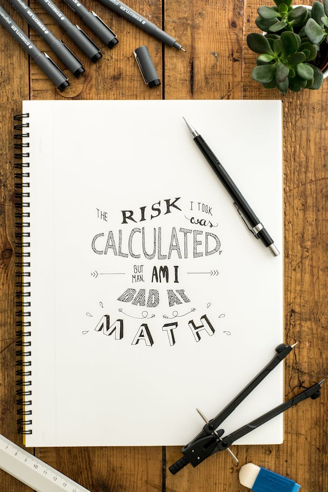
2. En tant que bio-générateur esthétique
Vous pouvez également utiliser notre site comme générateur de biographies esthétiques. Au lieu de rédiger votre biographie Instagram comme d'habitude, faites-la ressortir et démarquez-vous grâce à nos polices mignonnes. Ces polices mignonnes peuvent vous aider à faire une excellente première impression auprès des personnes qui visitent votre page pour la première fois.
Cela rehausse l'aspect et l'ambiance de votre profil. Cela suscite également la curiosité des internautes quant au contenu de votre biographie, ce qui augmente les chances qu'ils la lisent.

3. Pour l'histoire, mettre en évidence les noms qui attirent rapidement l'attention
Il peut être difficile de trouver des titres pour vos « Stories en vedette » qui donnent envie aux gens de regarder vos anciennes Stories. En effet, ces titres sont limités à 15 caractères. Une façon de les rendre plus intéressants, même s’ils sont très courts, consiste à utiliser des polices accrocheuses. Associez-les à de jolies couvertures pour vos « Stories en vedette », et vous êtes sûr d’obtenir plus de vues sur ces Stories !
4. Pour les réponses automatisées de vos marques aux clients
Utilisez-vous des outils d'automatisation des réseaux sociaux pour répondre automatiquement à vos clients lorsque vous n'êtes pas en ligne ? Apportez une touche humaine et personnelle à vos messages en utilisant des polices de caractères pleines de charme.
Vous n'êtes pas obligé d'utiliser des polices uniques pour tous les messages que vous adressez à vos clients. Utilisez-les spécifiquement pour les messages de bienvenue ou la première ligne de votre réponse lorsque vous vous présentez en tant que marque. Ces polices sont percutantes sans distraire vos clients avec des polices ridicules pendant toute la durée de votre conversation.
Instagram Noms des polices : Comment s'appellent les polices de signature d'IG ?
Comme mentionné précédemment, il existe de nombreuses polices esthétiques adaptées aux contenus vidéo, tels que les Stories et les Reels. Ces polices sont extrêmement utiles pour rendre vos vidéos encore plus captivantes et agréables à regarder.
Ce qui est frustrant avec ces polices, c’est Instagram vous indique Instagram leurs noms. À la place, la plateforme leur attribue des noms arbitraires, comme « Classic » ou « Neon ». Or, ce ne sont pas les véritables noms officiels des polices que vous voyez. Ainsi, si l’une de ces polices attire votre attention et que vous souhaitez la télécharger en ligne, cela peut s’avérer difficile.
Vous ne trouvez pas de noms de polices spécifiques sur Instagram ? Nous sommes là pour vous aider. Nous avons recherché et rassemblé les noms officiels de certaines des polices de caractères les plus appréciées de Instagram.
- San Francisco Bold: il s'agit de la police officielle Instagram pour son texte « Classic ». Intemporelle, simple et facile à lire, elle est idéale pour les contenus professionnels et minimalistes.
- Cosmopolitan: Vous adorez la police cursive « Neon » Instagram, qui imite les enseignes néon rétro avec ses lettres lumineuses aux allures fluorescentes ? Cette police appartient en fait à la famille Cosmopolitan. Elle est parfaite pour les textes auxquels vous souhaitez donner beaucoup de personnalité.
- Comic Sans: Eh oui, cette police farfelue qui divise les graphistes du monde entier est également présente sur Instagram. C’est celle aux lettres arrondies à laquelle on peut ajouter un effet de pinceau amusant et jeune en arrière-plan.
- Roboto Black: c'est la police qui s'affiche lorsque vous sélectionnez l'option « Strong » sur Instagram. Ses lettres épaisses et en gras sont parfaites pour les en-têtes et les premières images.
- Aveny-T: Il s'agit de cette police élégante et allongée que l'on retrouve dans l'option de police « Modern » Instagram. Elle est idéale pour donner à vos contenus vidéo un style sophistiqué, contemporain et épuré.
- Courier Bold: Pour finir, nous avons Courier Bold, la police « machine à écrire » de la palette de polices Instagram. Ce style est idéal pour les contenus nostalgiques qui évoquent une ambiance vintage et rétro. Il est également parfait pour les citations.
Les meilleures polices de caractères pour Instagram Reels : Les types de polices qui ont un impact sur la vidéo
On est facilement tenté d’utiliser n’importe quelle police mignonne qui attire l’œil lorsqu’on crée des Reels. Cependant, choisir la police à utiliser dans vos vidéos relève de tout un art. Voici les meilleures polices pour Instagram et les parties de votre vidéo où elles s’intègrent le mieux :
- Polices classiques et faciles à lire: ces polices épurées sont idéales pour les phrases et les paragraphes plus longs. Les Reels sont rapides et dynamiques. Il est donc important que les lecteurs puissent assimiler facilement les textes superposés dans vos images.
- Caractères en gras: les polices épaisses et en gras sont idéales lorsque vous souhaitez attirer l'attention de votre public. Elles ont toute leur place au début de la vidéo, lorsque vous présentez le sujet de votre Reel.
- Polices colorées: utilisez des polices colorées pour apporter une touche de couleur à votre texte et insuffler une touche de fantaisie à votre contenu. Elles peuvent être utilisées pour des paroles de chansons, des publications humoristiques, des incrustations pour des dialogues décalés, et bien plus encore.
- Polices manuscrites: les lettres cursives sont idéales pour apporter une touche de romantisme et de chaleur à vos Reels. Utilisez des polices manuscrites pour vos vidéos narratives destinées à susciter des émotions telles que la nostalgie, l'empathie ou la gratitude.
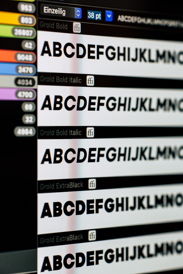
Attirez plus de followers avec les polices esthétiques de Instagram !
Utiliser des polices esthétiques est une excellente stratégie pour attirer l'attention des utilisateurs et augmenter la visibilité de vos publications. Sur les Stories et les Reels, vous pouvez utiliser les polices Instagram, qui vont des styles voyants et audacieux aux styles classiques et faciles à lire. Quant aux légendes et à votre Instagram , faites preuve de créativité en utilisant des générateurs de polices pour embellir votre texte.
Les polices de caractères stylisées constituent un moyen à la fois stratégique et créatif de rendre votre Instagram et votre contenu plus attrayants. Si vous les utilisez de manière cohérente, elles pourraient vous aider à attirer davantage d'abonnés et à développer votre communauté en ligne.
Mais aussi charmantes et tendance soient-elles, les polices esthétiques pour Instagram tout en matière de croissance. Si vous avez besoin d’aide pour promouvoir votre page et développer votre communauté, l’utilisation Path Social s’avérer plus efficace.
Notre équipe a pour spécialité de veiller à ce que le contenu de votre marque soit vu par votre public cible spécifique. Ainsi, vos publications (et les légendes que vous soignez tant) touchent des personnes avec lesquelles elles trouveront un écho. Cela augmente considérablement vos chances de gagner de nouveaux abonnés qui découvriront votre page. En un rien de temps, vous disposerez d’une communauté active et fidèle, composée d’abonnés authentiques qui adorent votre contenu. Gagnez dès aujourd’hui plus Instagram avec Path Social!





Vous voulez augmenter le nombre de vos followers Instagram ?
Utilisez notre boîte à outils basée sur l'IA pour attirer de véritables abonnés engagés et booster votre portée.
Augmenter le nombre de followers Instagram